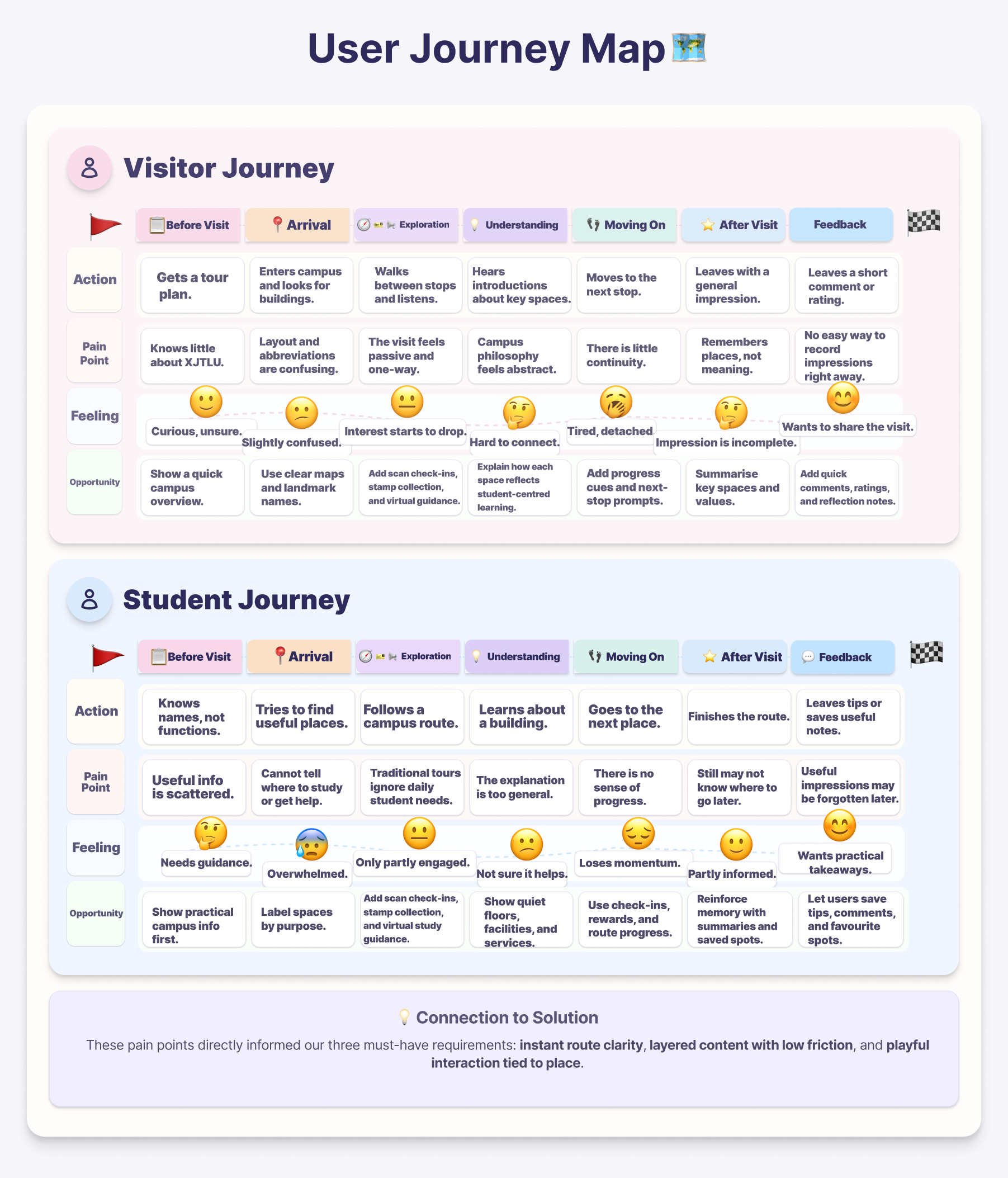
Mobile Map Platform

XยทEasyGo

An interactive journey bridging reality and digital storytelling through location-based AR technology.

Explore Portfolio
09:41
Smart Campus
Live Navigation
Location Based Tour

Welcome To XJTLU

Explore campus landmarks through a mobile map interface and immersive AR storytelling.

Illustrated view of the XJTLU campus
Campus Context
Learning + Route + Story
Campus Snapshot

A campus experience shaped by place, movement, and discovery

The platform is designed around the real spatial character of XJTLU. Instead of treating the campus as a static background, XยทEasyGo uses buildings, pathways, waterfront views, and learning spaces as interactive entry points for guidance and storytelling.

Spatial storytelling

Users learn through movement across meaningful campus landmarks rather than through static descriptions alone.

Mobile-first navigation

Campus routes, check-ins, and AR prompts are framed as an intuitive mobile journey.

Research

โœฆ the why

Why we chose this track?

We chose the Social track because XยทEasyGo is designed not only to guide users through the campus, but also to help them connect with the people, values, and shared experiences that shape life at XJTLU. Traditional campus tours often position visitors as passive listeners rather than active explorers, which limits both their understanding of campus spaces and their sense of connection to the university community. At XJTLU, this is especially important because the universityโ€™s student-centered philosophy is expressed not only through physical environments, but also through the collaboration, autonomy, and interaction that happen within them. Existing tours may provide basic information, but they do not always help new students build a sense of belonging, nor do they help external visitors understand how campus spaces support a socially connected learning environment. We therefore saw an opportunity to design a campus tour that is mobile, interactive, and socially engaging rather than purely descriptive. By combining route-based guidance, meaningful places, gamified check-ins, XR elements, AI-supported interaction, and opportunities for feedback and exchange, XยทEasyGo encourages users not only to discover the campus, but also to connect with its community, values, and everyday rhythm.

โ—Ž the gap

What existing work does well and where it falls short

To identify opportunities for improvement, we reviewed four academic papers and four commercial products related to location-based AR, campus orientation, mobile navigation, and playful exploration. Together, they show valuable patterns for guidance, storytelling, and engagement, but they also reveal recurring gaps in user-specific content, interaction that is meaningfully tied to the tour itself, and opportunities for users to comment on and discuss the tour experience.

Academic Papers

4 papers reviewed to understand educational value, feasibility, and design risks.

Paper 01

Location-Based Augmented Reality in Education

Kleftodimos & Evagelou (2025)

Open paper โ†—

Relevance: Explains how location-based AR connects learning content with real-world places.

Strengths

  • โ€ข Clearly explains the educational value of location-based AR.
  • โ€ข Describes triggering technologies such as GPS and indoor positioning.
  • โ€ข Provides practical examples from heritage and outdoor learning.

Limitations

  • โ€ข Lacks strong empirical evidence.
  • โ€ข Focuses more on technology than UX challenges.
  • โ€ข Many examples are closer to heritage learning than campus navigation.

Paper 02

Using a Location-Based AR Mobile App to Support New Studentsโ€™ Orientation

TaลŸyonar & Uzun (2025)

Open paper โ†—

Relevance: Directly studies AR-supported campus orientation for new students.

Strengths

  • โ€ข Highly relevant to campus orientation.
  • โ€ข Clearly explains implementation and system design.
  • โ€ข Includes real student testing and empirical evidence.

Limitations

  • โ€ข Did not outperform traditional guided orientation in knowledge learning.
  • โ€ข Reported technical and device compatibility issues.
  • โ€ข Small sample size limits generalisability.

Paper 03

A Game-based Augmented Reality Navigation System to Support Makerspace User Education in a University Library

Chen, Hwang & Lin (2023)

Open paper โ†—

Relevance: Shows how AR and gamification can support active exploration.

Strengths

  • โ€ข Combines AR with gamified missions and rewards.
  • โ€ข Provides a clear and structured interaction flow.
  • โ€ข Supports active learning through problem-solving tasks.

Limitations

  • โ€ข May prioritise engagement over learning depth.
  • โ€ข Context is limited to a library makerspace.
  • โ€ข Interaction design may be too complex for general mobile users.

Paper 04

Location-based AR in Education: A Systematic Literature Review

Fonseca et al. (2025)

Open paper โ†—

Relevance: Provides a broad overview of location-based AR in educational settings.

Strengths

  • โ€ข Reviews a wide range of educational use cases.
  • โ€ข Demonstrates strong potential for engagement and experiential learning.
  • โ€ข Identifies common trends such as field trips and outdoor learning.

Limitations

  • โ€ข Many studies still lack strong experimental evidence.
  • โ€ข Limited integration into formal education.
  • โ€ข Technical and usability challenges remain significant.

Commercial Products

4 products reviewed to analyse navigation, storytelling, exploration, and interaction patterns.

Product 01

Google Maps

Open product โ†—

Why relevant: A strong reference for map-based navigation and place information.

Strengths

  • โ€ข Strong navigation and map support.
  • โ€ข Familiar interface with low learning cost.
  • โ€ข Integrates place-related information effectively.

Limitations

  • โ€ข Designed for navigation rather than guided learning.
  • โ€ข Does not provide AR narration.
  • โ€ข Does not distinguish between different user roles.

Product 02

izi.TRAVEL

Open product โ†—

Why relevant: Useful for self-paced exploration and location-based storytelling.

Strengths

  • โ€ข Supports location-based audio guidance.
  • โ€ข Encourages self-paced exploration.
  • โ€ข Combines route structure with storytelling.

Limitations

  • โ€ข More audio-focused than AR-focused.
  • โ€ข Has limited playful interaction.
  • โ€ข Weak support for differentiated user roles.

Product 03

Pokรฉmon GO

Open product โ†—

Why relevant: Demonstrates how location-linked interaction can motivate exploration.

Strengths

  • โ€ข Demonstrates strong location-based interaction.
  • โ€ข Creates a strong sense of exploration and engagement.
  • โ€ข Blends AR-style interaction with everyday movement.

Limitations

  • โ€ข Designed for entertainment rather than education.
  • โ€ข Lacks structured explanatory content.
  • โ€ข Does not support user-specific information delivery.

Product 04

Actionbound

Open product โ†—

Why relevant: A useful model for mission-based exploration and active participation.

Strengths

  • โ€ข Supports task-based and route-based exploration.
  • โ€ข Encourages active participation.
  • โ€ข Flexible for educational content design.

Limitations

  • โ€ข Has limited AR emphasis.
  • โ€ข Depends heavily on creator setup quality.
  • โ€ข May feel more like a scavenger hunt than a guided AR tour.
โ–ณ gap summary

What existing work does well and what it still misses

3 Things They Did Well

  • ๐Ÿ—บThey show strong potential for combining route guidance with place-based information.
  • ๐ŸšถThey support self-paced exploration and can make users more active participants.
  • โœจThey demonstrate that storytelling, AR, and playful interaction can increase engagement.

3 Things They Missed

  • ๐Ÿ‘ฅThey do not provide dedicated explanation content for different user identities such as students and visitors.
  • ๐Ÿ“They lack interactive experiences that are meaningfully integrated with the tour content itself.
  • ๐Ÿ’ฌThey offer little support for user comments, feedback, or discussion around the tour process.

Stakeholders

Primary and Secondary Users

The updated questionnaire is strongly student-led, so student behaviour is the clearest evidence base in the dataset. The visitor audience is still essential to the project and is defined through the campus-tour scenario, then grounded by survey signals around first-time guidance, visual orientation, and low-friction access.

๐ŸŽ“ student users

The strongest signal in the survey

  • โ€ข 90.2% of respondents are Year 3 students, so everyday campus movement is the dominant behaviour pattern in the sample.
  • โ€ข Interest is high even though current service usage is low: 54.9% are very expectant and 76.47% are willing or very willing to use a guide in the future.
  • โ€ข Their top needs are stronger interactivity, richer explanation content, and fast mobile access that fits into fragmented routines.

Design priority: useful first, then playful and immersive.

๐Ÿงญ campus visitors

A smaller data voice, but a core product audience

  • โ€ข Visitors are not directly represented as heavily as students, so this segment is built from the project brief plus first-use signals in the questionnaire.
  • โ€ข 50.98% prefer 3D/AR panoramic tours when no human guide is available, which aligns closely with visitor orientation and discovery needs.
  • โ€ข 52.94% still want very fast loading and simple entry points, showing that immersive content only works if access remains low-friction.

Design priority: reassurance, landmark recognition, and memorable first impressions.

Distinct Personas

These two personas capture the clearest split in user needs: a freshman solving daily campus life, and a visitor reading the campus as a story about XJTLU.

Stakeholder Analysis

Quick view 01

Usage Status

17.65% used
  • Not Used 82.35%
  • Used 17.65%
Quick view 02

Expectation Level

54.9% very eager
  • Very Eager 54.9%
  • General 25.49%
  • Low Expectation 19.61%
Quick view 03

Future Intention

76.47% willing
  • Willing + Very Willing 76.47%
  • Uncertain 11.76%
  • Unwilling + Very Unwilling 11.76%

Expected features

Interactivity

74.51%

wanted more interaction

Content Depth

64.71%

wanted deeper explanation

No-Guide Mode

50.98%

preferred self-guided support

Fast Access

52.94%

preferred faster entry

Overall, the data points to a map-first guide that opens into richer content and light interaction only after orientation is clear.

Requirements

These materials translate the stakeholder findings into the product problems XยทEasyGo needs to solve.

๐Ÿ—บ user journey map

Current pain points before the proposed solution

The journey map shows where visitors and students lose clarity, confidence, or momentum before XยทEasyGo is introduced.

User journey map for visitor and student pain points

Requirements List

These three qualities are the minimum requirements for XยทEasyGo to feel useful, believable, and worth returning to.

๐Ÿ‘ค requirement 01

Customized content for each user role

The guide should adapt route cues, landmark explanations, and nearby service information to whether the user is a student or a visitor.

๐ŸŽ“student needs ๐Ÿงญvisitor meaning

why it matters: users most strongly expected personalised, role-aware content rather than one general tour.

โœจ requirement 02

Interactive engagement that supports exploration

Users should unlock content through map guidance, AR triggers, scans, and check-ins so the tour feels active, memorable, and easy to follow.

๐Ÿ“AR triggers ๐Ÿcheck-ins

why it matters: interaction should make the tour more engaging, not become a decorative layer.

๐Ÿ’ฌ requirement 03

Peer connection through shared feedback

The system should let users leave comments, quick reflections, or recommendations so the tour becomes a shared experience instead of a one-way presentation.

๐Ÿ“quick comments ๐Ÿคshared tips

why it matters: users also wanted a social layer that keeps impressions, responses, and peer connection visible.

R1โ€“R3 Design Translation

R1 Customized content

Design response: role-based and layered landmark content
Evidence: 82 users prioritised customised content

๐Ÿ‘คstudent + visitor

R2 Interactive engagement

Design response: AR triggers, scan entry, and stamp collection
Evidence: 75 users prioritised interaction

๐Ÿ“AR + scan

R3 Peer connection

Design response: message board, comments, and shared feedback
Evidence: 70 users prioritised peer connection

๐Ÿ’ฌcomment layer

Evidence of Life

We combined short on-site interviews with supporting survey visualisations to understand what users expect from a campus tour, what kinds of content feel useful, and where social interaction could add value.

Interview session with participant one
Interview 01: discussing first impressions, route clarity, and practical campus needs.
Interview session with participant two
Interview 02: exploring how users interpret buildings, services, and wayfinding cues.
Interview session with participant three
Interview 03: identifying what kind of interaction feels engaging without becoming distracting.
Chart showing top user expectations for campus tour features
Survey chart 01: users most strongly expected customised content, interactive engagement, and peer connection.
Chart showing preferred campus tour guide formats
Survey chart 02: users most preferred 3D or AR panoramic tours, followed by audio or video guidance and AI-supported help.

What we observed on site

  • โšกParticipants wanted faster orientation before any deeper content appeared.
  • ๐ŸซBuilding names alone were not enough; users wanted function, context, and nearby relevance.
  • โฑStudents described campus movement as short, task-driven, and time-sensitive.
  • ๐ŸคBoth interviews and charts showed strong interest in interactive content, personalised guidance, and more social connection.

What this means for the design

  • ๐ŸงญRoute guidance should stay immediate, simple, and landmark-led.
  • ๐Ÿ“šPlace information should explain both use and meaning, not just names.
  • ๐Ÿ“AR, audio, and playful moments should reinforce orientation, memory, and motivation.
  • ๐Ÿ’ญThe system should support quick everyday use while also enabling feedback, comments, and richer campus storytelling.

Ethical data collection

Participants were informed of the study purpose before interviews and survey collection. Participation was voluntary, no personal identity was published, and the material was used only for course-based design research.

Ideation

โœŽ the crazy eights

Eight rapid sketches exploring different UI directions

Crazy Eights wireframes for XยทEasyGo
๐Ÿ—บmap-first ๐Ÿ“–story layer ๐ŸŽฎplayful route

The clearest pattern was simple: navigation first, then role-based content and light interaction. This made the overall flow easier to understand.

โ‡„ design alternatives

Comparing identity models for the tour

๐Ÿ› Single visitor mode ร—

Everyone enters as a visitor and receives the same campus route and explanation. This keeps the flow simple, but student needs such as study spaces, services, and daily routines are not addressed clearly.

๐Ÿ‘ฅ Visitor / Student choice โœ“

Users choose their identity before the tour begins. Visitor mode focuses on campus background and representative spaces, while Student mode focuses on learning, services, and useful everyday places.

Chosen direction

We chose the self-selected Visitor / Student model because it supports customised content without forcing the system to guess who the user is. It also matches our core requirements: personalised guidance, meaningful interaction, and stronger connection to campus life.

๐Ÿ‘คself-selected role ๐Ÿ“šrole-based content ๐Ÿ’ฌsocial connection
โ—Œ low-fi prototype

Figma low-fi prototype

This prototype tests role selection, map browsing, landmark detail, AR entry, and progress feedback.

๐Ÿ‘คroles ๐Ÿ—บmap flow ๐Ÿ“AR entry
Open Low-Fi Prototype

Implementation

โ†— high-fi prototype

Live prototype

The live demo shows the current interaction flow across role selection, map-first guidance, landmark explanation, and playful feedback. It is designed as a mobile-first web experience for users walking around campus. It turns the system from a static concept into a working experience that users can navigate directly. It also demonstrates how personalised content, AR entry, and peer-facing features connect in one continuous journey.

๐Ÿ—บmap-first ๐Ÿ“AR landmarks ๐Ÿ’ฌshared feedback
Open live demo
โŒ˜ system architecture

How the system works

This workflow shows how role selection, route guidance, landmark content, AR guidance, check-ins, and progress tracking connect inside the system.

System workflow diagram for XยทEasyGo

Individual Contributions

Current contribution overview by member.

Lei Zhang

Lei Zhang

Research & Video

Responsible for user data investigation, testing, and video design and production.

Hanyan Niu

Hanyan Niu

Poster & Design

Responsible for poster production, user data investigation, product design, and testing.

Yiduo Guo

Yiduo Guo

Portfolio & Video

Responsible for portfolio writing, testing, as well as video design and production.

Qi Cao

Qi Cao

Build & Poster

Responsible for product implementation and poster production.

Reflection

๐Ÿงช usability testing

A/B testing with 10 participants

In the evaluation stage, we invited 10 participants to compare two different approaches to stamp collection.

Participants: 10 users
Method: A/B comparison
Task: complete stamp collection
Measures: time, effort, enjoyment

Prototype A

Users automatically receive a stamp when the location system detects that they are near a building.

Prototype B

Users must scan the signboard outside the building in order to obtain a stamp.

Key findings

  • โšกPrototype A was more efficient overall, with lower task completion time, lower error rate, and lower user effort.
  • โœจPrototype B produced stronger engagement and enjoyment, with engagement rising from 73 to 88 and enjoyment from 7.4 to 8.2.
  • ๐ŸŽฏPrototype A performed better on speed, while Prototype B better matched the playful and memorable experience users expected.
Radar chart comparing Prototype A and Prototype B across usability performance metrics

Testing outcome

Although Prototype A reduced time, effort, and errors, Prototype B delivered the stronger overall experience. Because engagement and enjoyment were central to our design goals, and aligned more closely with R2, Prototype B was selected as the final direction.

๐Ÿ‘ฅ alpha usability testing

Alpha testing with 3 real people

Participant coverage

P1: general student user A Year 2 student tested the overall interface flow, visual clarity, and whether common campus tasks felt easy to follow.
P2: first-time campus visitor A user unfamiliar with XJTLU tested whether visitor mode explained campus meaning and landmark value clearly.
P3: new student representative A Year 1 student tested whether student mode supported practical orientation, confidence, and daily campus use.
Tour experience score metrics used in alpha usability testing
Evaluation results from alpha usability testing with three users

Journey task

Participants completed the full tour flow: choose language and user role, enter the service hub, open the campus map, select a landmark, follow route guidance, read landmark information, complete a stamp or check-in interaction, and leave a comment or rating after the visit.

Key result

The score covered ease of use, navigation clarity, content usefulness, playfulness, social connection, and confidence. Playfulness scored highest at 4.7 / 5, while navigation clarity and confidence were lowest at 3.7 / 5.

Design changes from qualitative user feedback in alpha usability testing

What changed after testing

  • โœ“Stamp collection: added a clearer "Stamp Collected" confirmation message.
  • โœŽMessage board: made the entry more visible on the landmark detail page.
  • โ—ŽRole selection: clarified the difference between Student and Visitor content.

Next iteration focus

These findings guided the next refinement round: cleaner entry steps, clearer check-in states, and feedback that is easier to discover during the tour.

โ†บ iterative refinement

Feature refinements after review and testing

These screen comparisons show how key parts of the prototype were refined during iteration, especially the entry flow and the visual design of stamp collection.

๐Ÿ” entry flow refinement

The account flow was split into smaller steps. Instead of placing login choice and credential input on one crowded screen, the refined version separates the decision page from the sign-in form.

Earlier combined register screen
Earlier version: login or register selection and username-password input appeared in the same crowded screen.
Refined login or register choice screen
Step 01: users first choose whether they want to register or sign in on a lighter standalone page.
Refined sign-in screen in the entry flow
Step 02: the sign-in form opens as a separate page, so the credential input no longer crowds the first decision screen.
๐Ÿ… stamp collection refinement

The stamp book moved from generic medal graphics to landmark-based visuals, helping progress feel more tied to real campus places and easier to interpret at a glance.

Earlier landmark-based stamp collection design
Earlier version: the first place-based layout introduced building imagery, but the hierarchy was still quite flat.
Expanded view of refined stamp collection design
Final state: the collected set feels more specific, memorable, and place-linked.
โœง final reflection

What the process taught us

This project became much clearer once we stopped thinking of it as a general AR tour and started treating it as a role-based campus guide. The research, personas, journey maps, interviews, prototyping, and A/B testing all pushed us toward one core idea: XยทEasyGo has to solve orientation first, then add explanation, interaction, and memory in ways that feel meaningful to the place.

From analysis to user needs

The questionnaire, stakeholder analysis, and user journey maps showed that students and visitors do not explore campus in the same way. Students care about practical support such as routes, study spaces, facilities, and service points, while visitors care more about landmark meaning, campus identity, and memorable interpretation. This led us to define three core requirements: customized content, interactive engagement, and peer connection.

Design, iteration, and evaluation

The design process gradually moved from broad interface sketches to a map-first, role-based system. Our low-fi wireframes helped us test route entry, role selection, landmark pages, AR guidance, and progress feedback before moving into the high-fi prototype. The A/B test on stamp collection was especially important because it showed a real trade-off: Prototype A was more efficient, but Prototype B created more engagement and enjoyment, which better matched our project goals.

Challenges, privacy, and future development

The main challenge was balancing fast guidance with immersive storytelling. The current AR flow also relies on an external tool, so users need to switch screens during the experience; a later version should integrate our own AR module inside XยทEasyGo. If the system later stores roles, progress, comments, or personalised suggestions, users should know what is collected, why it is stored, and how long it is retained. Future versions could expand landmarks, improve QR and route accuracy, add multilingual AR support, and strengthen feedback while keeping data use minimal and transparent.

AI use and ethical considerations

โœ๏ธChatGPT ๐ŸŽฌJimeng ๐ŸงŠMeshy โŒ˜Codex
Workflow enhancements

Integrating AI tools gave us a substantial boost across writing, media production, 3D prototyping, and engineering. ChatGPT acted as a sounding board for section outlines and narrative styles, and also helped refine awkward phrasing and keep terminology consistent. Jimeng helped generate AI-assisted video clips for the product demo. Meshy accelerated our 3D pipeline by turning concepts into early 3D prototypes with automated textures, and Codex reduced boilerplate code while also supporting debugging during implementation.

Current limitations

The tools were helpful, but far from perfect. Generative visuals and 3D outputs sometimes produced strange artefacts or structurally incorrect results that had to be regenerated entirely. In the codebase, Codex occasionally suggested deprecated syntax or logically flawed snippets, so every line still required checking. Large language models also tended toward generic and mechanical wording, which meant we had to rewrite outputs to restore the teamโ€™s own voice and project-specific judgement.

Tools we used
  • Figma: For graphic design, prototyping and visualization creation.
  • Web Speech: For generating voice explanation.
  • Feishu: For project planning and arrangement.
  • GitHub: For collaborative development.
Key takeaways and best practices

Our biggest takeaway was that AI works best as a co-pilot, not an autopilot. It was useful for speed, but the outputs still needed close human supervision. AI-drafted writing often sounded professional while missing the nuance of our user research; visual and 3D outputs also needed cleanup, simplification, and revision. We also learned that effective AI use depends on prompt engineering and repeated comparison. Very few first attempts were usable without revision, so every AI-assisted paragraph, code block, visual, or 3D asset went through peer review before final use.

Framework for responsible AI application
  • ๐Ÿ›กPreserving originality: AI was not used to define the core design strategy, synthesise user research, or draw evaluation conclusions. Those parts remained fully human-authored.
  • ๐ŸทTransparent attribution: AI-generated assets were clearly labeled, such as video outputs from Jimeng or 3D assets supported by Meshy.
  • ๐Ÿ—‚Comprehensive logging: the AI platforms used in the project were explicitly listed in the projectโ€™s AI tools reference index.
  • ๐ŸงพTraceable commits: repository commits with substantial AI assistance were marked with prefixes such as [AI-Assisted] or [Codex-Draft].
  • ๐Ÿ‘€Human accountability: all AI contributions were reviewed, edited, and approved by the team before they were integrated into the project.
AI references
  • Meshy AI, Meshy 6, accessed on 2026-04-26, available at https://www.meshy.ai/. Used for 3D model generation.
  • Jimeng, Seedance 2.0 Fast VIP, accessed on 2026-05-08, available at https://jimeng.jianying.com. Used for generating AI-assisted video clips for the product demo, including animated hook scenes, user feedback visuals, and promotional motion sequences.
  • Codex, GPT-5.5, accessed on 2026-04-19, available at https://chatgpt.com/codex. Used for front-end portfolio implementation, UI layout refinement, content structuring, product demo development, and video demo planning.
  • ChatGPT, GPT-5.5, accessed on 2026-04-19, available at https://chatgpt.com. Used for refining portfolio text, generating video storyboard ideas, and improving reflection and evaluation descriptions.
Research Stakeholders Requirements Implementation Reflection Contact